It’s a slow process getting all the elements for a cover together. This is yet another thumbnail or revision for the new Starforgers cover. In this one, Byron has changed to a new marble background and he’s altered the colors of the coin to be predominately silver with a gold accent. He’s included the old subtitle for reference. It will get changed to something like BOOK ONE of the STAR TRILOGY.
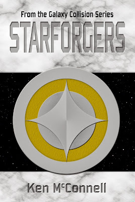
Other things that will change in the next iteration will be the texture of the gold band in the coin. It will be shinny like the silver ring in the Starstrikers cover. That bumpy texture will be added to the inner circle to set it off from the four point star. We may see some text start appearing on the outside ring.
Other things to come are a darkening of the main title text to match Starstrikers and more stars added to the star field.
It’s starting to come together and become its own cover. Byron will be updating the Starstrikers cover and even laying out the third and final cover – Starveyers while he’s in the groove. We hope to have books one and two out this fall in ebook and paperback.
I can’t wait to see them finished and sitting together. They’re going to look fantastic!
Just an FYI; this book is about the start of the Great War and therefore, the look of the cover is lighter and more shinny than the Starstrikers cover. The marble is representative of the first building material and indicates the early Federation which existed for a long time without knowing war.
I hope you all enjoy this behind the scenes look at how a cover comes together. It’s always fascinated me and its why I love to do things myself. I get to have my fingers in the design decisions as they happen.