Starfighters in Profile

I’ve had this idea of making a series of art books based on the old Aircraft in Profile series that my dad had when I was growing up. They were In-depth histories of fighters with multiple profiles in color of each aircraft.

The hardest part of doing a book like this is actually drawing all the different profiles needed. I was either going to have to figure it out myself or hire the task out to an artist. I decided to go ahead and learn how to do it myself. I don’t profess to be a great digital artist, but I’m learning. Here are some of the first and easiest profiles that I’ve done so far. These are all KiV-1 starfighters from my Star Saga series.

It all starts with a vector based line drawing like you see below. This one shows the fighter from the left, bottom, top and right side. I didn’t do a head-on shot. Mental note: do a head-on shot. The top and bottom sides are blended which will be more evident after this one is “painted”. The program I use for this is called InkScape and it’s free and open source.

After I have this sketch completed, I import it into Gimp, which is a free and Open Source Photoshop clone. That’s where all the magic happens. Below is another version of the above line drawing but with just a left/top/right orthographic view. This attempts to recreate the cardboard model of a KiV-1 that I built years ago.

By the way, the KiV-1 is about the same size as a P-51B Mustang, as seen in the models below.

The real point of doing this is to show multiple liveries on the same starfighter. I’ve started doing this with separate files as seen below. The first one is nearly complete. I still haven’t learned how to do shading, so I may come back to this one later and add that. But it does have decals and unit markings.

The Type 33 variant just has the main parts painted in but lacks any decals or unit badges. The Type 35 is still in the process of being painted. Each color has its own layer in Gimp so you can color outside the lines and then just use an eraser to clean them up. Once I realized this was the way to go, things go so much easier. You start with an insanely high resolution vector file and then lower it to about 1000 to import it into Gimp. The zoom in and out feature is your friend.

Because these are different types, there should be some visual different in the appearance other than just colors. I have not attempted that yet. Also, usually on these profiles the aircraft are weathered a bit. Again, have not learned how do to that yet. So I have a ways to go before these are ready for print. But at least now you can see where I’m heading with this project. Eventually I’ll move on to the Alliance fighters which will have readable unit names and numbers.

The unit markers were done seperately in InkScape and imported as a layer in Gimp. Inkscape is perfect for creating cool looking unit badges and other decal type markings.

One thing that surprised me when doing these profiles is how much fun they were to make. Listening to some jams and just coloring in Gimp was pretty relaxing. A nice creative break from writing novels and a good way to make art while the dumpster fire of 2020 burns in the backgroung.

Writing Update

I have completed the first round of edits for Destroyer – Book 4 of the Starship Series. The name of the book is Declo Demons. It’s the first book of the middle trilogy of the series and it’s set about six years after the last Corvette trilogy book.

We’re still working on getting the cover art wrapped up. The next phase is a complete read through to catch any editing mistakes and then I’ll build the ebook version of the novella. Hopefully we can get it released in September.

Above is the actual photograph of the model that will appear on the book’s cover. Minus the tripod and C-stand.

I have two more novella’s in that trilogy that need edited and covers, so once we get them completed, we can release them pretty quickly. I’m writing the first book of the final trilogy of the series now, which takes place twenty years after the middle trilogy.

New Starship Models

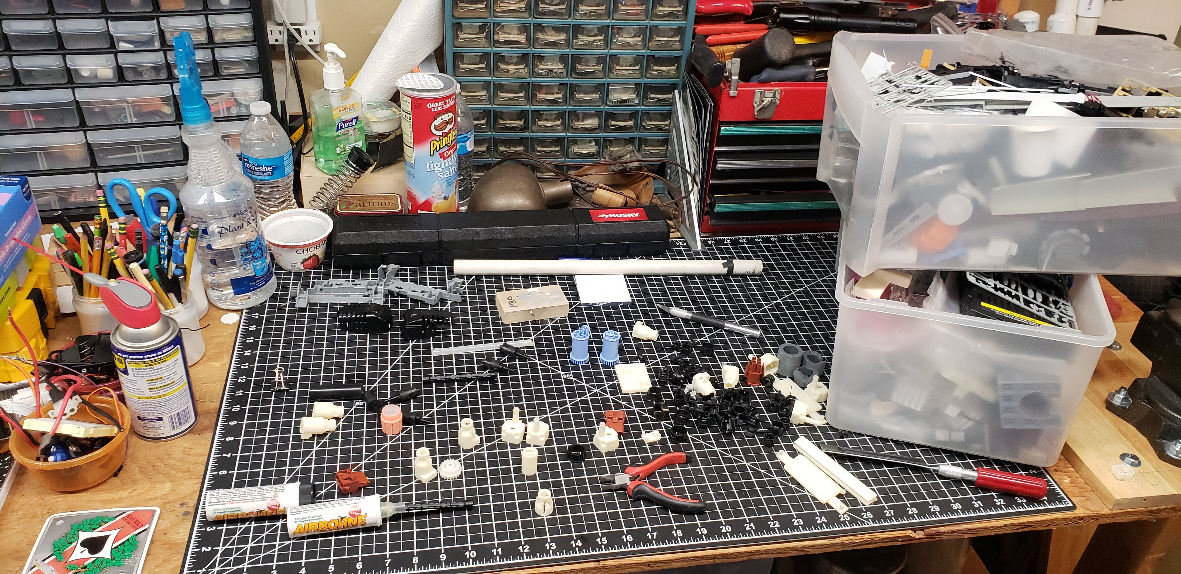
It’s fall and the temperature here in Boise has finally come down to tollerable levels. This means it’s model building season at House McConnell. My workbench is already dirtied up with bits of plastic and a new model frame on the stand. I have to create two new starship models for an upcoming trilogy of Destroyer novellas.

I’m starting with a Sultran Warship which is loosely based on drawing a buddy of mine did when we were kids. Of course I’m improvising the build and using a bunch of kit bashing parts from the junk bins of the company I work at. I’m hoping that foks won’t recognize anything and that I have used and it will look unique in the universe for which it was built.

There is another warship, slightly smaller that I still haven’t worked out yet. I’m considering something more along the lines of a rocket or perhaps a submarine-like shape. The Sultran ship will be a matte green color, so I might do the opposing forces in silver or something completely different than what we’ve seen before. The stories are set in a distant star system that is not part of the main Federation, and can therefore be very different in just about every way imaginable.

Stay tuned for more progress posts on these models.

Cover Art

We’ve put together a new cover, this time for the Corvette 3 novella. It will be the third book in the Corvette Trilogy and the first and only to feature the new Corvette model. Well, never say never. I mean it could return for a later series appearance. Once again, this cover is put together by my brother, Byron McConnell. Another awesome job by him!

I created the new Corvette a year ago, that’s how far ahead I think. It started with a sketch and finished with a model.

The Kootenai is named for a town in my home state of Idaho. So was Weippe, now that I think about it.


Cover Models, Corvette 3

The Corvette 3 manuscript is being scrutinized by Beta Readers at the moment, so I have some time to prep the starship models I built for the cover shoot. This began by using canned air to blow the dust off of both the pirate ship and the new corvette. More time was taken on the Kootenai to ensure dust and hairs were removed as it would probably be in the foreground. I had to glue a piece back on that the air can blew off, but other than that, they were good to go.

I still don’t have an exact idea how the ships will be positioned on the cover. I’ll try and replicate a scene from the novella and make it look visually interesting. But the end cover will come alive after a decent Photoshop session from Byron, my cover artist. The color scheme will include mostly blues and oranges. No more black and white covers like Corvette 2.

The title will be orange and the nebula and twin black holes in the background will be blue. I’m going to rely on Byron to make all that. I think the end product will be engaging and fit with the previous covers of the series. Since this is a trilogy and the next books will be called Destroyer, I’ll probably combine three novellas into a single book and charge $1.99 for it. That cover might be just a collage of the other covers.

The ebook should be out at the start of this summer with the paperback version probably coming out in the fall.


Star Saga Mug

In the things you need that you didn’t know you needed department, I give you my new mug design. It includes all the covers from the first trilogy of the Star Saga. All five books, including the two in-between novellas. The covers are set against a blue-gray field so they pop better and completely wrap around a standard mug. You can purchase this fine product from Redbubble.

Now you can admire the fabulous covers while sipping your favorite hot beverage and if a friend happens to ask you who that Ken McConnell bloke is, you can tell them how much you loved my novels. See what I did there, I created a marketing tool for all my fans to use. If you get this mug, send me a picture of you using it and I’ll tweet it out on Twitter!

Black Star Build, Part 1

This model was going to be a little different from my others. I wanted to build it fast and on the cheap. I didn’t want to spend money on specific model kits for details and I wanted to use just what I had on hand to build it. I work for a large tech company in the valley and I have access to lots of mechanical parts in the garbage bins. I decided to recycle those parts into a bad ass starship. This would save time and money and hopefully produce a model in record time because I was writing the book as fast as I could and that book needed a cover model.

I used these drawings as I wrote the novella and so started with them when it came time to build the Black Star. The ship was originally a long haul transporter with a single big Class C stardrive and lots of modular container pods to store things. Pirates took the transport over in a raid and then slowly converted it to a brutal pirate ship with lots of guns and shielding.

With this in mind, I surveyed my junk pile in the garage and found some parts that would work for the basic frame. A large plastic pipe and some hard drive mounts would be the first parts I selected. I went with a block of RenShape for the mount, as has been my standard for some time now. You can drill it out for a metal rod mount that can be secured with a set screw and that fits on my C-stand model mount

The SS Wieppe model is there for scale. The Black Star had to be bigger than the tiny corvette.

The plastic pipe fit into this piece from the junk bins at work. All I added was some PVC board to give it some heft and to build out the container pods.

The head was a concern until I found this wonderful clear plastic fan cover from a high end PC. The above photo shows the mount block drilled out and the PVC boards cut for the pods. Always laying out the design in a test fit before reaching for the glue. Also in the above shot you can see some plastic bits that I thought would make great container details.

I used PVC pipe for the neck and now the final size of the ship comes together. Can you spot the yogurt cups? Used as spacers between the cargo pods.

Once again, you can see the true scale next to the 1/350 Weippe model. The Black Star was wired for light in the stardrive, but I elected not to use it in the end.

Close up of one of the cargo pods showing the details placed on the sides. I had enough to cover both sides of each pod.

Here is the engine section showing the mount. It’s not a solid as I had thought or hoped for. Bad things were coming…

Building up the cargo pods and boxing inn the bridge section. Boring work that needs to be done.

Some more computer parts are selected for the bridge section. These black pieces will go on each side of the bridge.

Had to have some fun, so I started detailing the bridge with model parts. I love this part of scratch building.The PVC board lets you glue plastic parts on with plastic cement.

More juicy model bits on the bridge section. That’s it for this installment.

Cover Art Evolution – K’nat Trap

Every book I release has a cover that is produced by myself and my graphic designer brother, Byron. Since we are working in the Sci-Fi, Space Opera genre and in one particular universe, we try and have starships on the cover to get that fact across to future readers. We also have a certain style that we carry over from book to book so that readers get a visual clue that this new novel fits into the same universe as the last one they may have read. Being consistent with the branding helps readers find you and stick with you throughout your series.

All the covers start out with a concept doodle, by either myself or Byron. For K’nat Trap the original idea was mine and I imagined a K’nat starfighter being targeted by another fighter’s computer system or heads up display.

I didn’t have in mind any particular color but knew that the star field had to be blurred to suggest speed and that there had to be some kind of target reticule. The book’s title would be in the same font as the other series books and so would the author name.

The first thing I had to do was build the model of the K’nat Trap. That was already underway and after it was finished, I photographed it against a black felt background and sent the high definition image to Byron. He sucked it into his series book template in Photoshop and then added the text. He used a stock image for the target graphic while he worked on doing his own original version.

The green color was striking and it would stick with us for the whole process. I had a few suggestions for this version; punch up the brightness of the stars and the target. Also, we needed to start adding subtitles that declared the book to be a Star Saga story.

Now we’re getting somewhere! The image popped and the color was still working for us. Now to take out the stock image target and add Byron’s original version.

At this point I decided to try another color. The resulting experiment turned out to be too red and green or Christmas-like.

We tried again, this time going all red. The font changed to what we refer to as the bad guy font or Votainion font and it appears on the Devon’s Blade and The Blood Empress covers. Unfortunately, we felt it didn’t have the right impact so we went back to the regular series font. Byron also added some engine flare in blue.

I showed this one and a green one to some folks at work and they all seemed to prefer the old font an the green color. More comments indicated that the white lines in the target were distracting. So we changed things again, going back to green.

After studying this version I decided to call it done. It was eye-catching and it looked sharp. We could have kept tweaking but at some point you just have to pull back and let it be. This whole process took about a month for us to finish but of course building the model took many months and so did writing the book.


What’s a K’nat?

My next novella will drop in July. So I’m introducing it early to generate some interest. The idea is to get folks to go buy it on pre-order so that it has a big first day when it finally comes out.

First things first. How do you pronounce K’nat? I pronounce it with a short a like in “bat” but a silent “K”. It’s spelled like gnat, with a Votainion “K” instead of a “G”. Make sense? Okay then.

So what is it?

K’nat fighters are the NexGen or Next Generation of starfighters built using the same technology that the Eclipse had in Book Four – Starstrikers. So if you have not read Starstrikers yet, you might want to read that one first. K’nat Trap takes place chronologically a few years after Starstrikers and features two Starstriker agents, Kiloe and Tamia on a secret mission to recover a downed K’nat fighter on a bog planet. If that premise seems vaguely familiar to you, you might be an aviation buff.

The source material for this novella is the Japanese Zero that crashed on an island in the Aleutians at the start of WWII. American forces recovered it and took it to California where they got it flying again and then learned the airplane’s secrets. The F6F Hellcat from the Navy was designed to specifically defeat the Zero fighter based on what we learned from the captured Aleutian plane. I used the name of that island as the name of the planet where my K’nat fighter crashed – Akutan.

Below is the model I built of the K’nat fighter. It was constructed of plastic and scaled to 1/32. There are lights in the headlights and engines.


This model was used for the book’s cover which hasn’t been revealed yet. Stay tuned next week for that! If you want to see some detailed pictures and commentary on the making of this model, you can check it out here.

It was even rendered as a 3D mesh by my son using Blender. His is sleeker, I suspect. 

The design was crazy complicated to work out, so I built a cardboard model of it first. Here’s that model along side stablemate Votainion starfighters from the same era.

Here’s a size comparison with a P-51 fighter from WWII. Just about the same wingspan as the legendary American fighter.