Every book I release has a cover that is produced by myself and my graphic designer brother, Byron. Since we are working in the Sci-Fi, Space Opera genre and in one particular universe, we try and have starships on the cover to get that fact across to future readers. We also have a certain style that we carry over from book to book so that readers get a visual clue that this new novel fits into the same universe as the last one they may have read. Being consistent with the branding helps readers find you and stick with you throughout your series.
All the covers start out with a concept doodle, by either myself or Byron. For K’nat Trap the original idea was mine and I imagined a K’nat starfighter being targeted by another fighter’s computer system or heads up display.
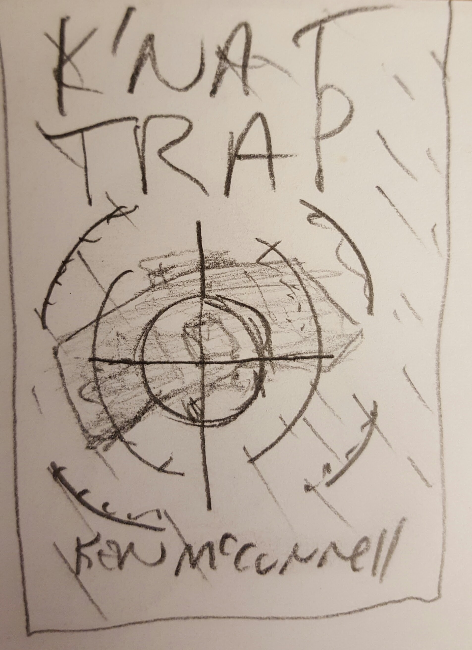
I didn’t have in mind any particular color but knew that the star field had to be blurred to suggest speed and that there had to be some kind of target reticule. The book’s title would be in the same font as the other series books and so would the author name.
The first thing I had to do was build the model of the K’nat Trap. That was already underway and after it was finished, I photographed it against a black felt background and sent the high definition image to Byron. He sucked it into his series book template in Photoshop and then added the text. He used a stock image for the target graphic while he worked on doing his own original version.
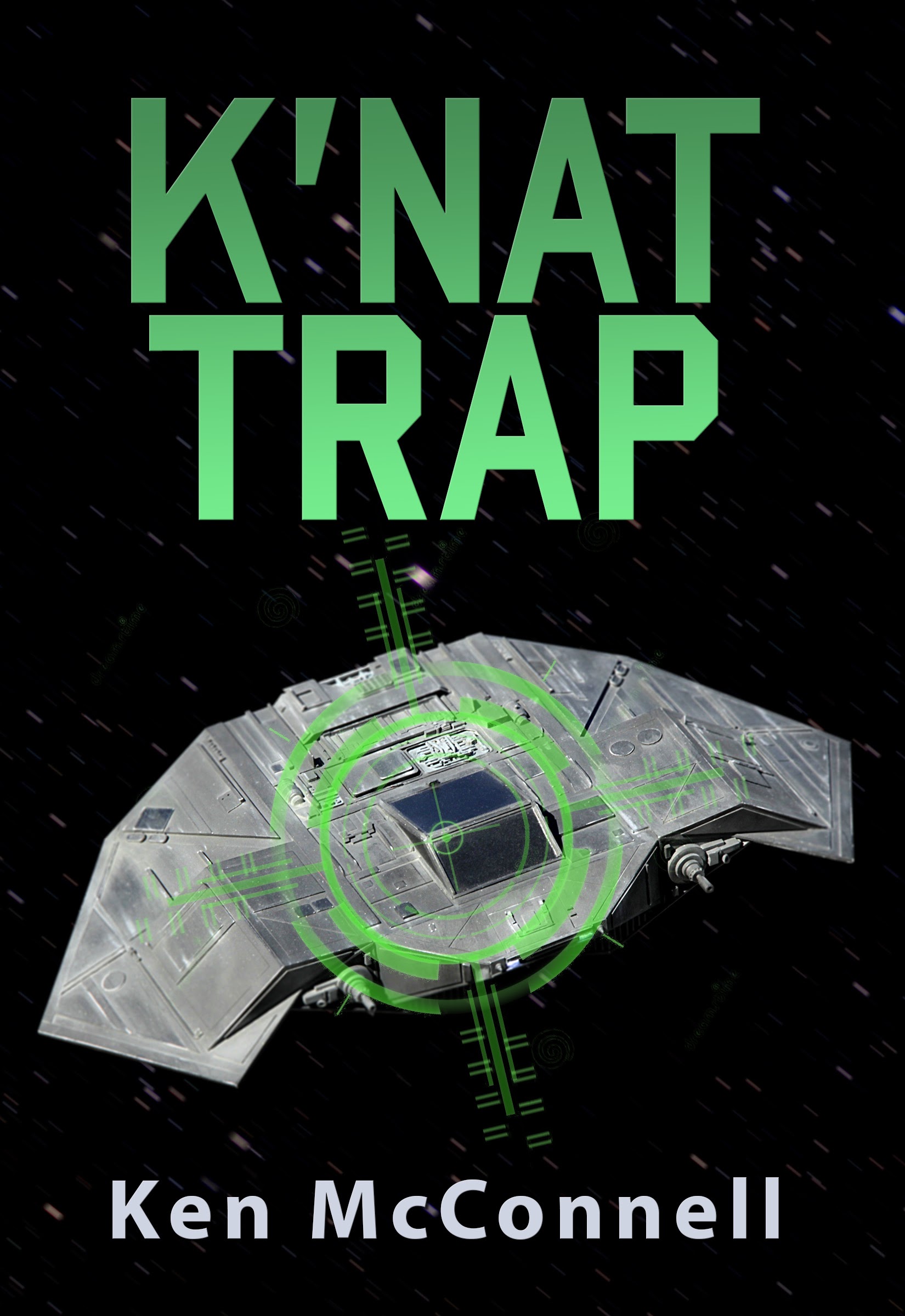
The green color was striking and it would stick with us for the whole process. I had a few suggestions for this version; punch up the brightness of the stars and the target. Also, we needed to start adding subtitles that declared the book to be a Star Saga story.
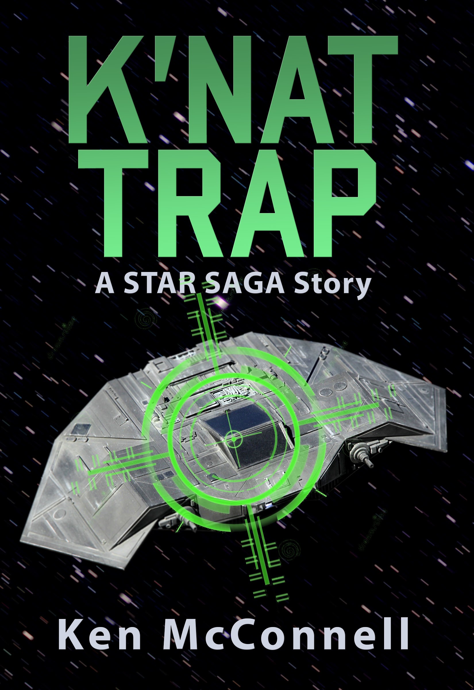
Now we’re getting somewhere! The image popped and the color was still working for us. Now to take out the stock image target and add Byron’s original version.
At this point I decided to try another color. The resulting experiment turned out to be too red and green or Christmas-like.
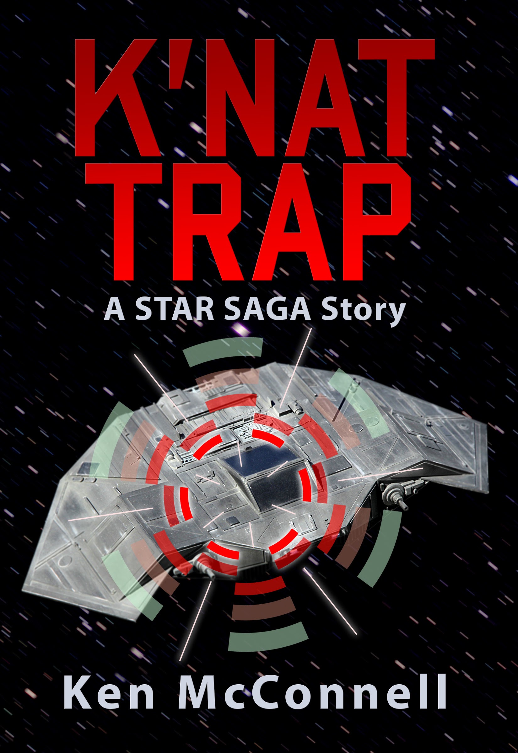
We tried again, this time going all red. The font changed to what we refer to as the bad guy font or Votainion font and it appears on the Devon’s Blade and The Blood Empress covers. Unfortunately, we felt it didn’t have the right impact so we went back to the regular series font. Byron also added some engine flare in blue.
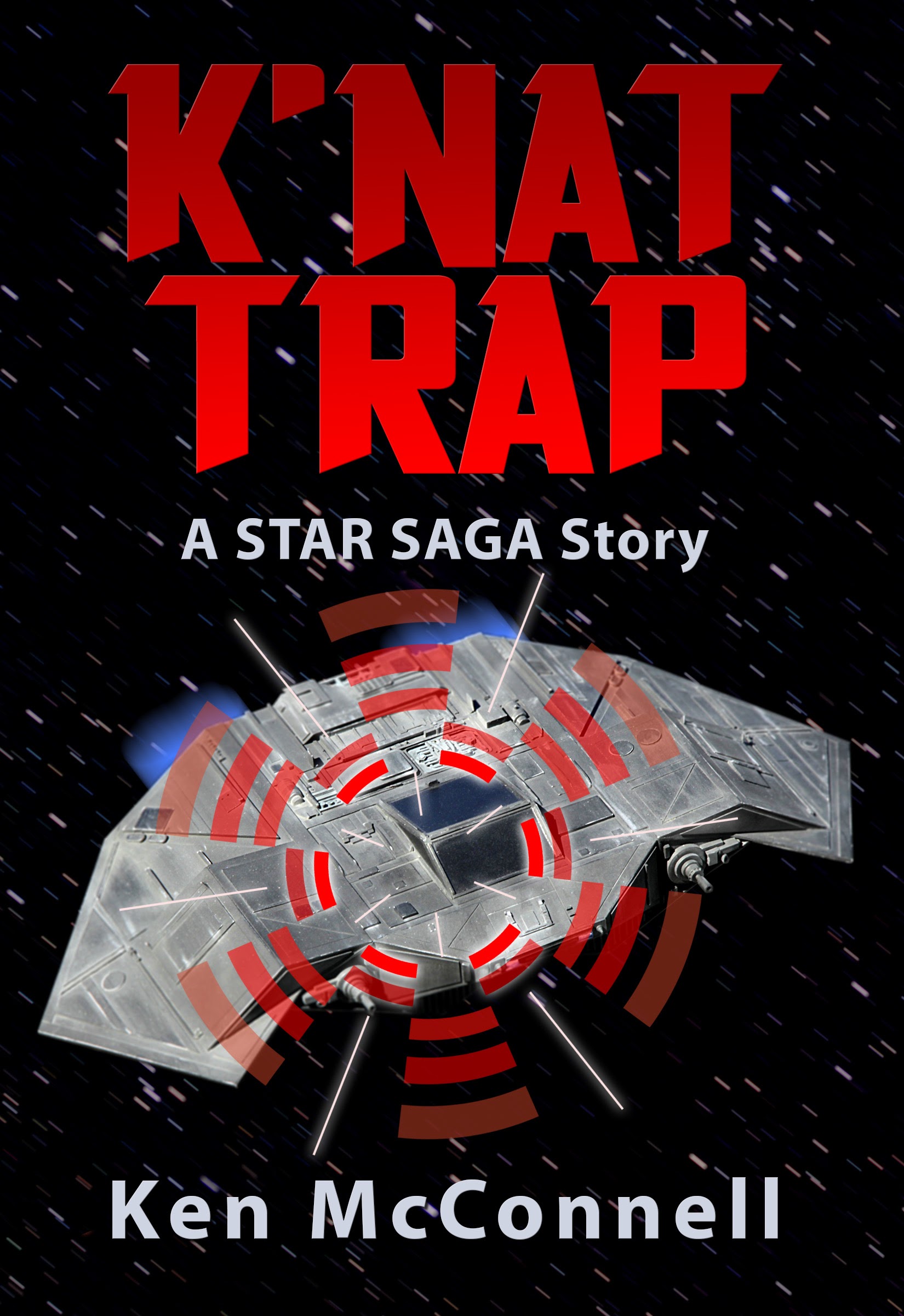
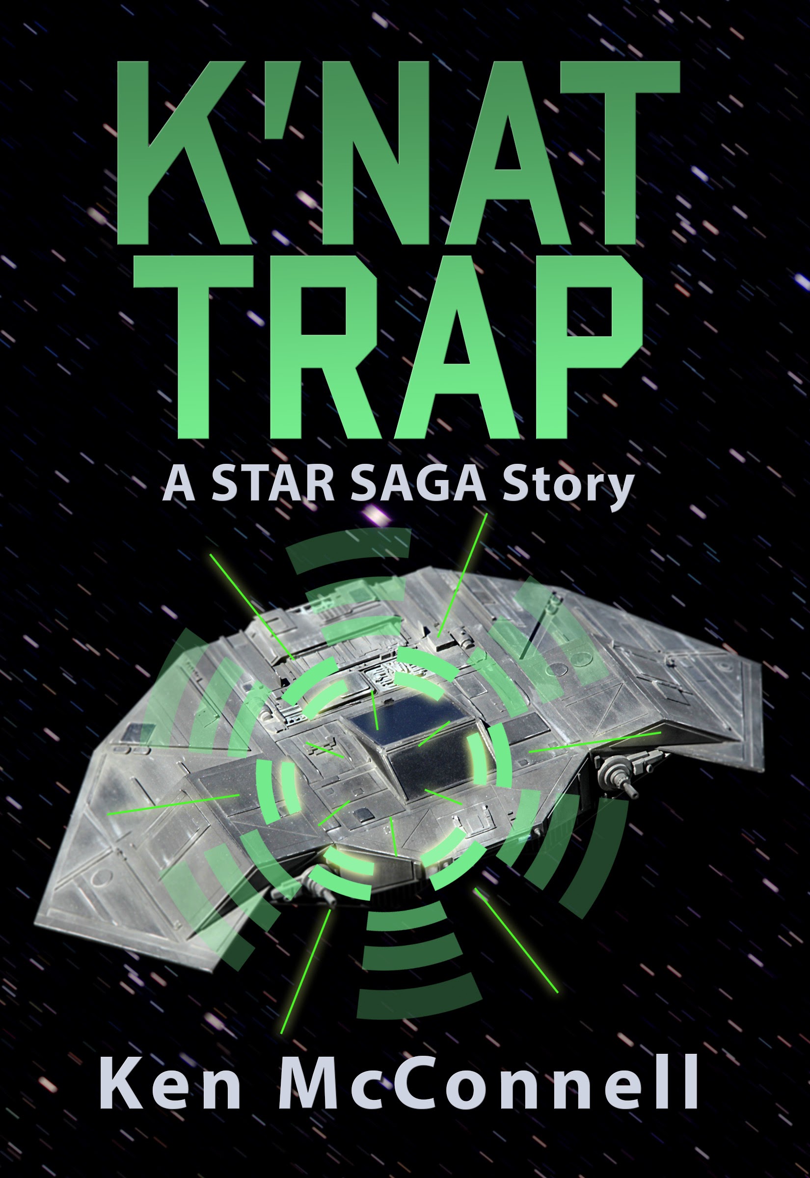
I showed this one and a green one to some folks at work and they all seemed to prefer the old font an the green color. More comments indicated that the white lines in the target were distracting. So we changed things again, going back to green.
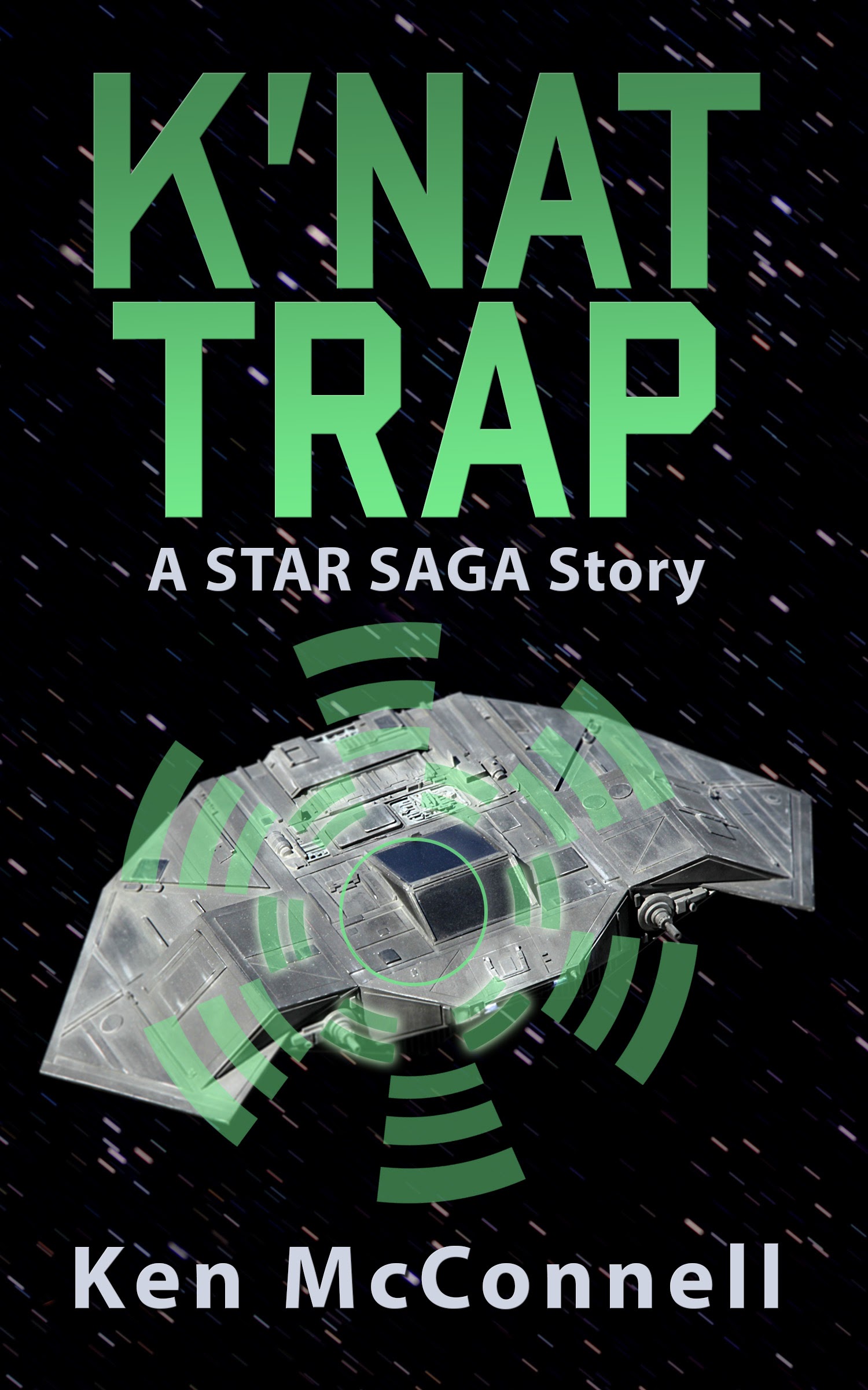
After studying this version I decided to call it done. It was eye-catching and it looked sharp. We could have kept tweaking but at some point you just have to pull back and let it be. This whole process took about a month for us to finish but of course building the model took many months and so did writing the book.