I thought it would be interesting to talk about how covers evolve using my latest novella. The covers for my Star Saga are usually designed by me and executed by my graphic designer brother. This is the most thought out series of novellas we’ve done since the original Star Saga coin books.
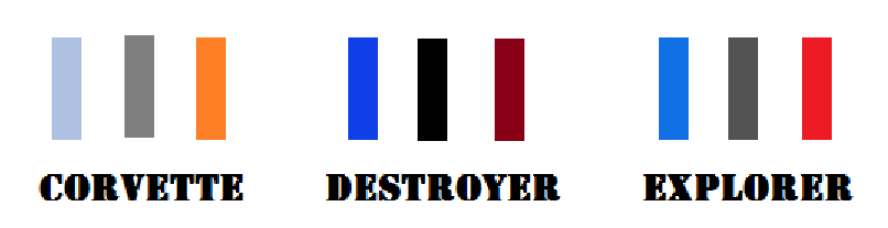
The color schemes for each book within the trilogies is: Blue, Gray, Orange. The Corvette trilogy used lighter colors for the titles: Light Blue, Gray and Orange. The Destroyer trilogy uses darker shades: Dark Blue, Black and Dark Red.
The Explorer trilogy will use slightly brighter colors to signify coming back to service: Blue, Darker Gray and Red.
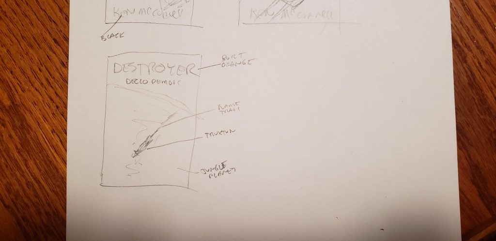
It all starts with a few thumbnail sketches and a search for the perfect background. Below is the sketch I made for Declo Demons. I imagined a darker, jungle planet and a smaller Truxtun streaking downward like a meteorite.
I found a blue planet shot and tried to make a demo cover with Gimp.
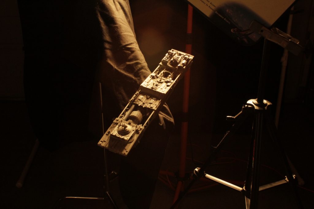
It just didn’t have any motion or interest. I used a generic photo of the ship model that was not lit properly.
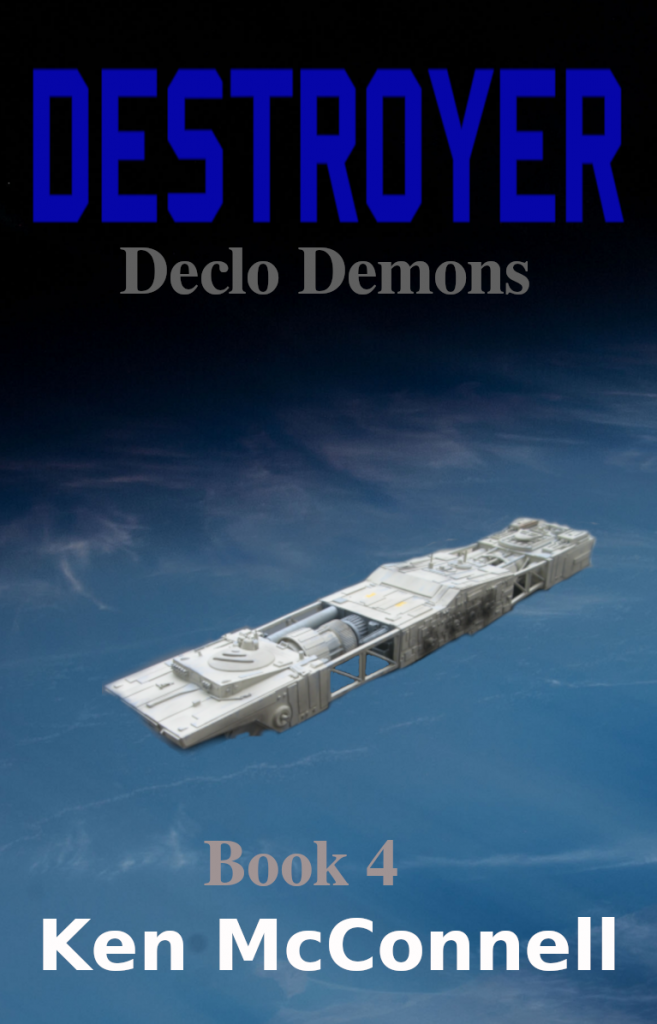
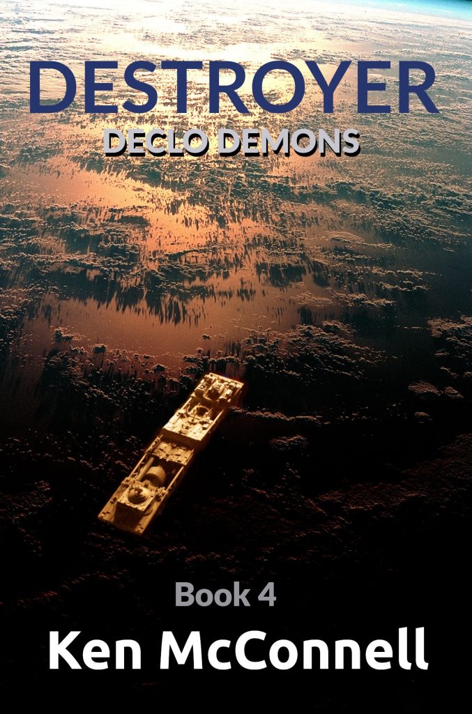
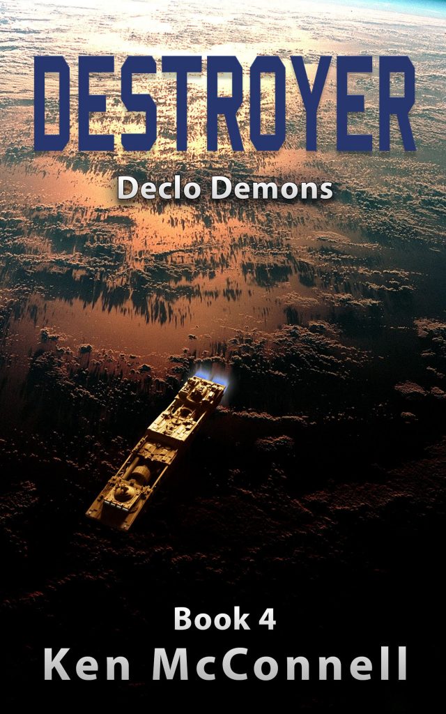
Not happy with this version, I found what was to become the perfect background image and then did a proper photographic session with the model, to closely match the original sketch. I didn’t have the proper font for the title, but the darker tone does come through. From this, Byron was able to make what became the final cover.
He added engine exhaust, navigation lights, porthole lights and proper fonts. The final product turned out exactly how I originally envisioned it when I sketched it out.
I hope you enjoyed this look behind the scenes of what goes into the cover art of my books. You can download the eBook version of Declo Demons wherever they are sold. A paperback version will hopefully be available before the end of the year.