
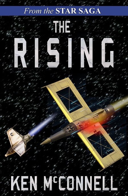
Here’s the latest cover version of my next novel. It’s Book 2 in the Star Saga and takes place about five years after Starforgers, Book 1. We are stepping away from the unit coins and going all starship action for the next two book covers. This includes an all space background which means we have to rethink the title.
We are sticking with the same font and the same series banner for continuity sake.
This version uses the marble from the Starstrikers cover as if the title was cut out of marble.
But that doesn’t scale well. So the next version will try something different for texture on the title font. Either a light gray or perhaps the steel of the coin from Starforgers.
The image on the right has been adjusted a bit in terms of alignment. I do this using cut and paste in Gimp so that Byron, my cover designer can see what the finished product should look like according to me. He then takes the original art and modifies it with care in Photoshop. I’ve also removed one of the ships to help focus the eye of the viewer.
Next Byron will fine tune the damage and make alterations in color for the ship’s exhaust flames. The cover is getting closer to finished and I think it will attract some attention when it finally launches. The models were built and photographed by me using my new blue screen set up. I’m building new models for Book 3 which should ship some time next year.
It’s currently in the outline stage of writing.
As usual, comments are welcome from anyone.


Looking at the three images, the two you provide and the banner for the site, I think it’d be much better with that light in the banner in the damage area than that red fog. You’ve mentioned sparks as a replacement, too. Looking forward to a sample of those, hopefully.