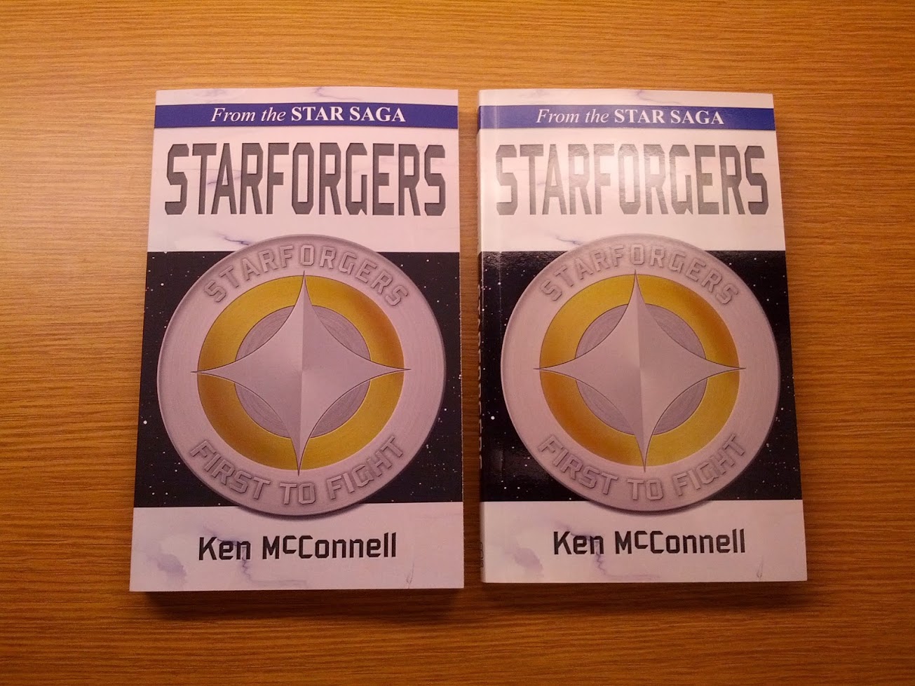
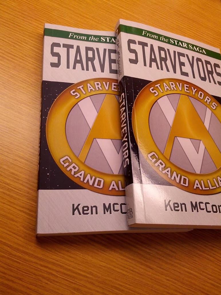
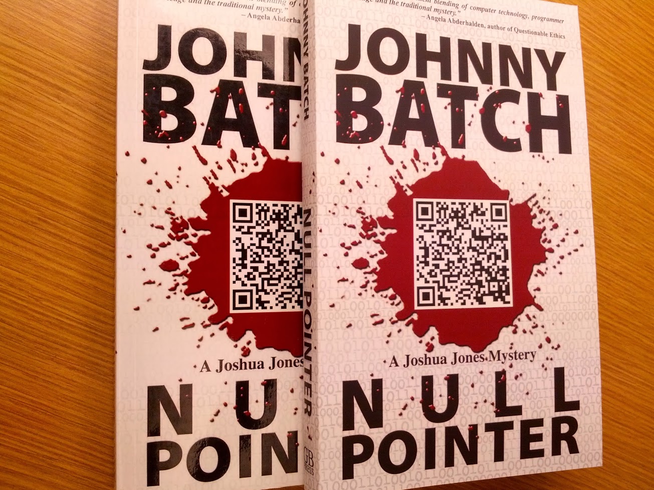
CreateSpace has recently began offering the matte finish for its paperback books. So I made the switch on all of my books and ordered a copy of each. Below is a photo essay featuring a few of them. Some notes and observations.
- The matte finish has a soft leathery feel like the backs of some modern electronics. Makes you want to touch it.
- The pdf files for all these books are identical. Nothing changed but the materiel of the actual cover.
- Matte finish seems to make lighter textures pop more and have more contrast.
- The colors are muted in the matte finish. If you rely on color to sell your cover on the shelf, stick to glossy.
- Something about a matte finish makes the same book feel more luxurious.

So what do you folks think? Should I leave them matte or switch them back to glossy? There can only be one option or the other, not both.


I just ordered the matte for my upcoming release. At first I liked the look of the old glossy finish, but I love the hand feel of the matte, and after looking at them side by side, I like the matte better.