When the decision was made to put together an anthology of short stories the first thing I knew it needed was an eye-catching cover. The anthology would be e-book only, at least to start with and the cover needed to be something that portrayed what the stories were about. It also had to look good on e-book readers from Droids and Kindles to iPads. My clutch cover designer for both of my previous books was my brother Byron. I started asking him to research ideas for the cover based on the Space Western stories featured in the book.
I had in mind Western movie posters and looked at dozens of them on the internet. But nothing was really grabbing my attention. Then Byron sent me a batch of posters that he found online and I started going through them.
They were from the 1950’s and 60’s and featured foreign films as well as American films. One poster in particular stood out for me and you can see it below. The black hatted gunman with a pistol aimed right at the viewer.
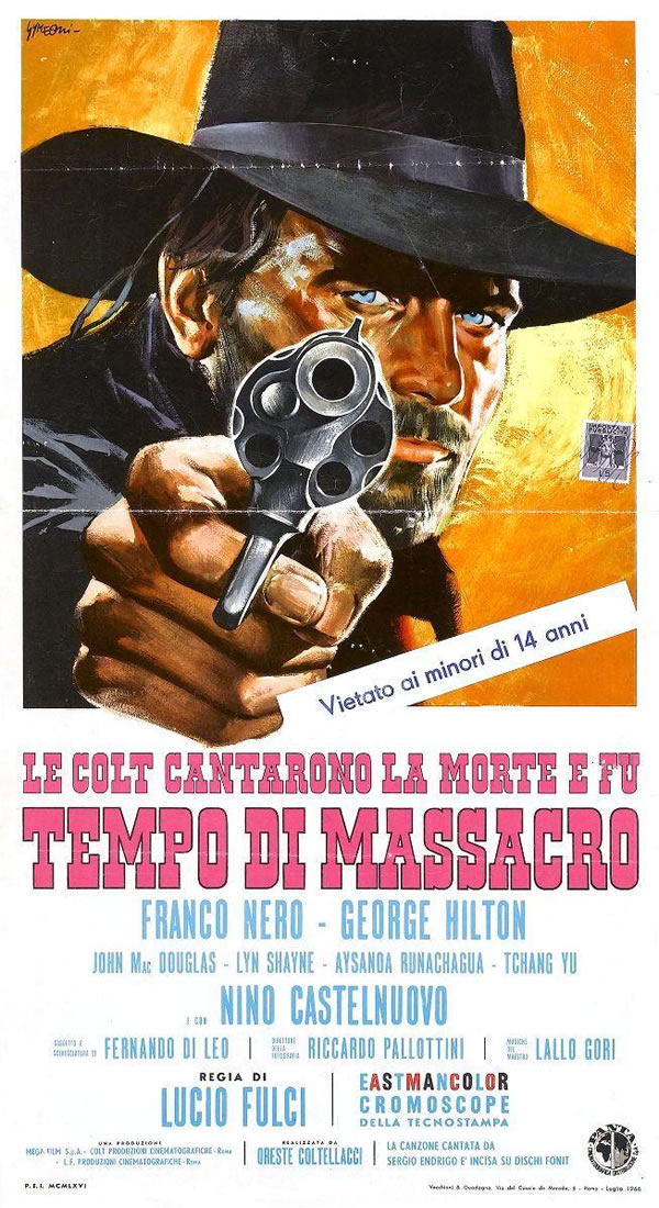
I really liked the in-your-face attitude of the design and thought it would be perfect if the man were replaced by my black colored android called Eighty-eight.
So I told Byron to see what he could come up with. His first sketch was done using Poser with a stock android model that he modified to suit my character.
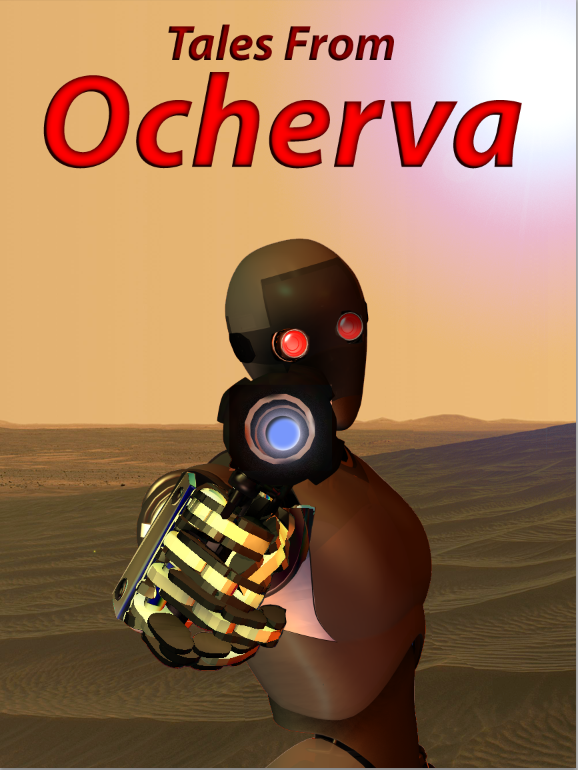
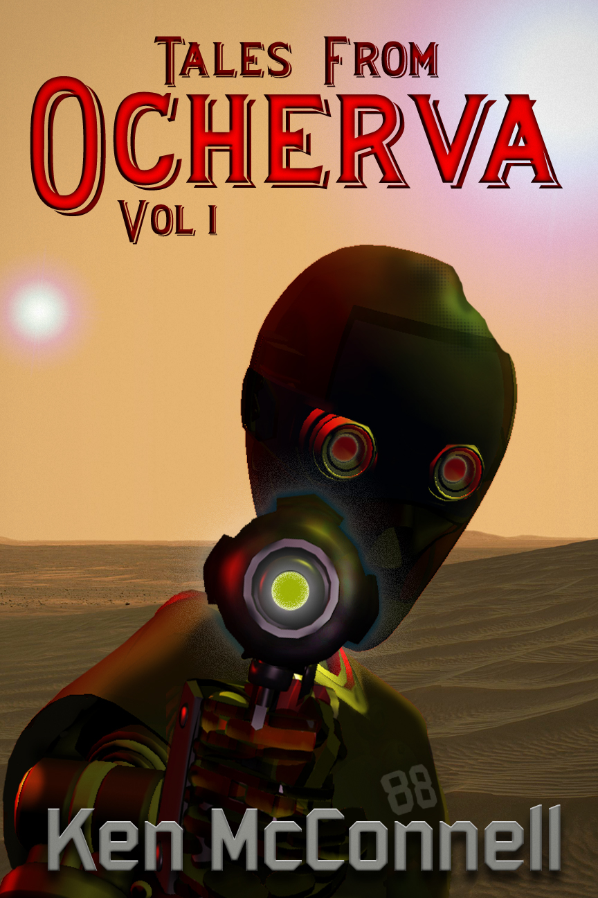
I liked the android, especially the red glowing eyes but the tilt of the head and the distance of the body made it less intimidating than the original poster. He added a stock NASA picture of the actual surface of Mars, which looks remarkably like the deserts of Ocherva, where the stories take place.
The font of the title was just a place holder.
We agreed to pull in closer on the android and darken it a bit to match Eighty-eight’s color. I started looking for a font that would suggest western without going too far, as was the case for many of the designs in Firefly.
I drew a pencil sketch of how I saw the cover looking and sent it to Byron for use as a reference.
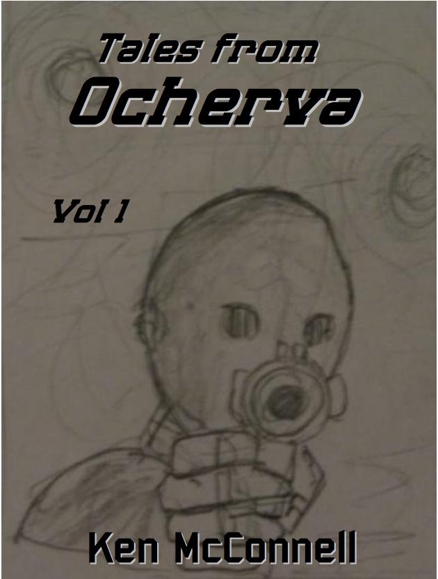
I added some font ideas to the sketch to get an idea of what the final version might look like.
We knew the author’s name would be in the same font as Starstrikers, to maintain continuity as they both take place in the same SF universe. But the Western inspired title font had yet to be determined.
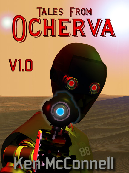
The next iteration from Byron was much closer to the final look. He added the second star in the sky and moved in closer on the body. He also used the font that I found that suggested a Western flavor without being too Western. Other improvements were the glowing gun and the android’s name/number on its chest.
This is where the cover settled for many weeks as I had friends look at it and offer suggestions. You may have remembered seeing the post here on the blog where I asked for comments from readers. I compiled a list of little suggestions and sent them on to Byron. The result was the final version of the cover that you see below.
Next up I will show the behind the scenes screen shots from Byron’s computer and let him explain his process.