Last time I showed off the rough sketch I did for the cover of my anthology, Tales from Ocherva Volume One. A collection of Space Western short stories set on the planet Ocherva from the Galaxy Collision universe.
Today I’m showing off the first design sketch from Byron. The font is not final, he just used that in order to show size. The actual font will have a more Western feel to it.
The android model is from Poser and the dunes are actually from Mars.
He’s experimenting with colors and eye shapes and the gun amongst other things. But I think you can tell the idea is definitely eye catching. The android is Eighty-eight from the lead-off story, “Tin Star” about an android sheriff.
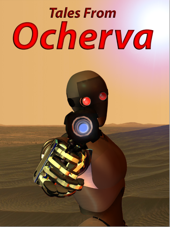
The reverse tilt of the android’s head is kinda gangsta style, not sure I like that, but we can play with it a bit. The orange colors are perfect for the planet. We’re going to try and make the android a bit more shiny plastic looking.
Like a black iPod. I was pretty stoked about the concept and now I’m really starting to love it.

I like the overall picture concept and the background. It matches up with my perception of Ocherva after reading those shorts. 88 obviously has to be at the very edge of town and I think it works.
Two things I don’t like…and these are simply my observations from my own experiences:
1) I can’t see a droid tilting its head for a shot for any reason. It just seems to me that it would have its head in line with its body unless there were some other compelling reason, such as to look around a corner. A droid wouldn’t really even need to have the weapon up at eye level to get an accurate shot off if it had any experience with the weapon at all. Especially one with 88’s background by the time it left.
2) The gold bands on the fingers are just too distracting. I’d suggest that if you have to have them there, tone them down. They’d be burnished by now, not brand new shiny. The second finger from the bottom wouldn’t be sticking out like that, either. I assume there’s no trigger guard?
I kind of like the bas relief font. Can we see a mock up with that like in the one on the left?
Those minor points aside…I like!