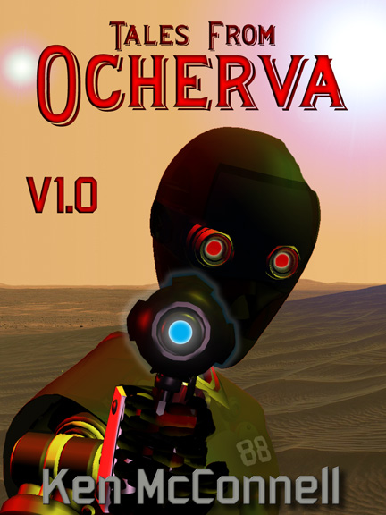
I just got this latest proof of the Tales from Ocherva Volume One cover from graphic designer Byron McConnell, and had to share it. He’s got all the design elements in place that we talked about last time. The font is correct, the angle of the android’s body is spot on and so is the aim of it’s blaster.
best online pharmacy with fast delivery buy femara online with the lowest prices today in the USA
online pharmacy buy tirzepatide without prescription with best prices today in the USA
He’s even added the second sun in the orange sky.
Moving in closer to the subject has definitely made it more intimate and threatening.
best online pharmacy with fast delivery buy super kamagra online with the lowest prices today in the USA
He’s even added the android’s name to it’s chest plate – Eighty-eight.
online pharmacy buy antabuse without prescription with best prices today in the USA
More comments as I’ve had some more time to study the image.
online pharmacy buy furosemide without prescription with best prices today in the USA
Needless to say, I’m thrilled by the cover and can’t wait to get the anthology out on Kindle, Smashwords and Scribd.
Bill – I agree with the bright brass knuckle. The details of the fingers do need to be brought out a bit. A little separation of fingers from blaster grip is needed. I also love the blaster glow.
Nate – The face is blank because the android is not designed to replicate human emotions. The cold face of a killer is intentional. The font is perfect, perhaps a more raucous slant to better recall the movie Western posters of the 50’s.
I would also like to explore some filters like perhaps making the whole image look more like a cartoonish poster. Or perhaps an oil painting. I’m open to different ideas, but I really like this as it is now. Wish there was a way to not make the CG look like CG and perhaps more photo-realistic.
Have to say that I agree with Bill on most comments. I think the 88 should be a different color or perhaps have a border outline sot hat it looks like patches that are attached to the shirt.
I also think that there should be some more detail in the face. The face is a great way to get an emotional reaction from the viewer and I can’t seem to tell whether or not this robot is angry or happy (minus him pointing a gun at me of course).
Last thought would be a more “robotic looking” font for the main title perhaps?
I like this one better, especially getting the blaster aimed right. ;-) Nice fonts too!
Right off the top I see two issues, for me.
What the heck is that bright orange thingamajig over what seems to be its knuckles?
That question literally expresses my point — it’s too distracting and draws my attention repeatedly to that piece of flat orange metal trying to figure out what it is. I keep trying to look over the whole picture, but my attention keeps coming back to that one piece. I think it takes away from the overall picture.
The second is maybe due to being so distracted by that orange piece, but it seems to me that 88’s left side is perilously close to blending into the sands in the background.
It’s also a little hard, at least on my monitor, to make out any details of the hand holding the blaster. That might be something that should be looked into so that it’s more obvious he’s holding the blaster? As opposed to it being an appendage of 88.
I love the faint glow around the blaster itself. An aura of power…cool way to delineate the blaster from its face!!!