I’ve been plugging along on the second Starforgers novel, The Rising. Up to 18,000 words on the first draft.
Happy to be back in this time period writing about Devon and the Silicants again. This is the second book of the Starforgers Trilogy, so expect some serious white water on this ride.
Byron and I have been working hard on getting the paperback versions of Starforgers, Starstrikers and Starveyors ready to sell. We are going with the 5×8 format and are using CreateSpace as the printer. We used them for my Mystery novel and it looked fantastic.
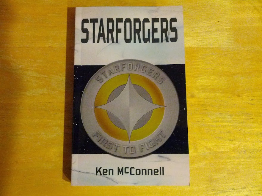
Here is the first proof copy of Starforgers. We always do several of these for each book to tweak the final look and feel of the product. The binding and interior layout are perfect in this first try.
But the cover suffers some pinking in the color and the spine is slightly miss-aligned.
I also use this first proof as a copy edit, reading through it looking for typos and formatting errors. We went with white paper on this version and I think it looks real sharp. But I have to admit, the cream colored paper is easier on my eyes and more like a traditional hardback book.

Here is a comparison of the two books, Starforgers at the top and Null Pointer on the bottom. You’ll notice the line spacing is smaller for Starforgers. This is so we can squeeze a longer novel into the same thickness as Null Pointer. We do this to decrease page count and thus keep the price under ten bucks.
Book sellers have told me that if I can keep the price of my books lower than twelve dollars, customers are more willing to buy them based on hand selling.
I personally think it’s a steal. You get a larger than Mass Market paperback for the same price as most ebooks by the bigger publishers.
We don’t really make much money on these paperbacks primarily because the sales numbers are so low. But you really need a physical product to sell in local indie stores and to do signings with. I usually have a few in my car and will give one away if I think someone will read it. The cost to me is about the price of a fast food burger. But if that person reads it and tells someone else about it, the cost is justified.
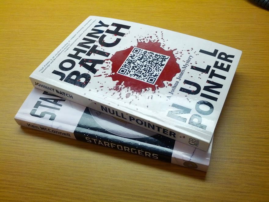
This is both paperbacks together for comparison. They look pretty sharp for a Self-Published effort.

One last look, this time at the interior, to show off Byron’s fantastic layout design. He uses Adobe In-Design to do the layout, the same software the big boys use. I can’t recommend his services higher. If you are going the Self-Publishing route, get a professional to layout your book.
You won’t regret it and your readers will love you for it.
We’ll spend the rest of this month and next month doing this for Starstrikers and then Starveyors. Our goal is to be finished with them in time for me to take some to Norwescon in March. I think we can achieve that.