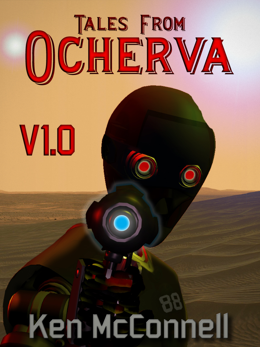
This is the latest proof of the cover art for my forthcoming anthology – Tales From Ocherva, Volume One. With this version, Byron is focusing on the coloring of the android and darkening the area around the author’s name. I think he’s got that bit nailed down, as the cover is readable from any size, especially the thumbnail size on most book store web sites.
best online pharmacy with fast delivery buy accutane online with the lowest prices today in the USA
online pharmacy buy synthroid without prescription with best prices today in the USA
We should have the final version ready to go this week.
online pharmacy buy lopressor without prescription with best prices today in the USA
Comments welcome, last chance to help us improve the cover.
online pharmacy buy hydroxychloroquine without prescription with best prices today in the USA


Jeremy Carey-Dressler has suggested the blue gun barrel glow be white and maybe add a muzzle flash. The blue color looks like a kid’s bubble blower gun. I agree, blue works for engines, but not guns.
Wow, the cover looks really good. My only comments would be that the Header “Tales From” (not to make a pun here) looks kind of Cryptic, maybe a blockier font type. Also 88’s body detail looks fantastic as well but its head although shadowed quite nicely lacks substantial detail that makes it come to life. It would seem that if you wanted to shadow its head that much, you would want to back it up just a bit, bring the shadowing down a little deeper into the top half of its body and carry the effect onto the ground behind it. In turn it makes 88 out to still be a curiosity but in much greater detail. Thus, allowing for a more eye catching experience. Either way the story rocks, great work!
Jeff, good suggestion. That should be easy enough to do. Add some little dings and scratches to the paint job.
Bill, the resolution is definitely not as smooth as it would be for a larger final product. Since this is only going to be an e-book, I told Byron to not worry about resolution much past the size of the covers on the front page of this blog. But if we ever went to print with it, it would need to be sharper.
Steve, thanks for the input! That goes for everyone!
Ken, you’ve gotten my input and I think if you lighten those yellow segments going out to the hand and define a trigger guard by lightening the area it will be obvious the “finger is on the trigger”… Nice stuff!
I’d noticed the dent and acknowledged it as such. The only thing I found distracting about it was what I attributed to resolution: the line of the edge of 88’s head looks to be non-smooth. What I mean is that in graphics programs, when you draw a line at an angle and look at it up close, it’s not a smooth diagonal…it’s got some smooth runs but also has a step to one side to continue that angle. Aliased instead of anti-aliased? Make sense?
Other than that, I like the sense of foreboding the picture presents, myself. Not being a fan of Jason and such ilk, I didn’t make the connection to a hockey mask, I just saw a robotic face.
I like the new cover for the most part. I like the Hockey mask look that 88 has as well. The only thing that I see that could be changed is that 88 looks to good. There is no dust or dings or scars on him anywhere. He is an old robot. he should show some signs of wear. He looks like he just rolled out of the factory to me.
Bill, I agree with you on the separation of the hand. Perhaps a few highlights on the tops of the fingers will help complete the picture in the viewer’s mind.
Nate, I see what you are getting at. The hockey mask is a good description. I wonder if that ill-at-ease feeling is a good thing. Anyway, it might be easy to smooth that out. The android does have a few good dents in his round head – mentioned in one of the stories.
Overall I think the appearance is solid. My only real issue is that there is something off putting, which I can’t put my finger on when it comes to the general look of #88. I think that it might have to do with the current shape of his head. Based on how it is shaped right now makes it look like he is wearing a “Jason Mask”.
I think that this might be able to be easily fixed by making the head look a bit more continuous. Meaning more rounded and sleek if that makes any sort of sense…
Comparing this against the last one I have available to look at, Ocherva-Cove-V2-VanGo.jpg, I like the darkened 88 body, it makes it stand out better from the sands in the background. However, intentional or not, it’s no longer so obvious that 88 is holding a blaster pointed at you. It may be my screen, but I have to look really hard to even see that there might be a hand there. The end result, if I didn’t know what it was, was that the robot was looking at some glowing thing floating in front of its face. I think that’s the only point of concern in this version: it’s not obvious about the blaster being held by 88.
The title and name do stand out better so those should be left alone if any further changes are made.