There is no denying that a lot of thought goes into designing a book cover. From font type to cover art many elements have to converge into a design that makes the reader want to pick it up and that hopefully makes the reader proud to own it.
Many SF/F covers have elaborately painted scenes from the novel that bring the story to life. Some have cutting edge visual effects or graphics that hint at the technical nature of the novel.
If the book is part of a series or set in a universe with multiple books, the challenge is to let the reader know that with graphic design and layout. You may have a great one-off cover idea but if book two in the series looks like it is set in another universe, it could turn off the reader. Consistency in design can breed reader familiarity and comfort.
When Byron and I talked about the design changes we would be making for the second edition of Starstrikers, we spent time considering how to make it fit into a three book series and how that series would fit into a multi-book universe. What we came up with is both unique and hopefully familiar to my new and growing readership.
Starstrikers is the middle book of a three book series set in the Galaxy Collision universe. The same universe will have short story anthologies and other novels set in it. But the first trilogy of books will define the look and feel of them all. So we had to come up with a defining style that would bind all of them into the same universe.
The first series in the GC universe is known as the Star Series. Starforgers, Starstrikers and Starveyers. Each novel is set during a different period of a century long galactic war. Starforgers is set at the start of the war, Starstrikers during the middle of the war and Starveyers is set after the war. Each novel is also a complete unto itself story with an entirely different cast of characters. But they are tied together by this epic war.
I have always envisioned these novels as being the book ends of the entire GC universe. Each book defines the style of story telling that all the books in that particular time frame should have. For instance, Starforgers is about the forging of a new political and military alliance. It takes place at a time when space travel was harder and more difficult. The stories set in this time frame focus on rugged individuals who cherish their freedoms. You might think of them like Westerns. Space Westerns, to be exact.
While stories set in the Starstrikers time frame are more about military struggles and often feature soldiers or conflicts in general. You might think of them more like war stories. Because they are set during the middle of an intergalactic war, they more often resemble Military SF.
Starveyers stories are more hopeful and often have themes of prevailing over obstacles or coming together for the betterment of all. Reconciliation is a big theme. The two former enemies work together to repair the damages done by the long war.
So with all of that in mind, we decided to do the following: Bombardier was chosen as the common font for the whole series.
It is used for the titles of the three Star Series books and it is used for the author name in all the other books in the series. All three of the Star Series books have the same foundation look to them with the stars of space behind a coin of some kind. The foundations change from Marble to Concrete to Metal representing the progression of architectural foundations that stand for the building of a galactic alliance.
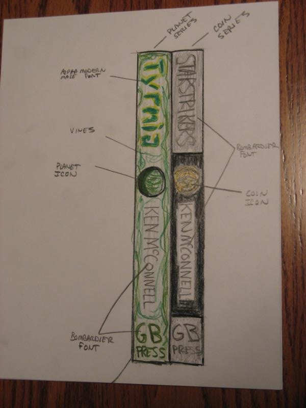
This drawing shows possible layouts for the spines of the two major series of books set in the Galaxy Collision universe. The Star Series is on the right and the Planet Series is on the left. The Planet Series books all have planet names as their titles and are for the most part, set on a single world. For students of the genre, they are known as Planetary Romances. The first Planet Series book to come out will be Tyrmia.
You can see right away the common elements in booth series as they are set in the same universe.
The Planetary books will have different title fonts, in this case we use Alpha Modern Male and retain the Bombardier font for the author’s name. Other similar elements are the planet icon where the Star Series books have a coin icon. If a reader were to see these two books on the shelves next to each other, they would immediately see the connections between them. That is the goal. Reader recognition.
![]()
Here we see a mock-up of the new Starstrikers spine. We’ve added the coin icon and enlarged the spine title to match the cover title. The Press logo is independent of any books released by the imprint, so it will remain unchanged from books not in the GC universe.
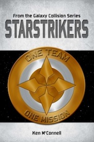
Below is the final version of the Starstrikers cover compared with the first edition cover. We loved the elements of the initial design, and we felt that they could be improved upon while still keeping the iconic look that we already enjoyed. The first change was to cut the “From the Galaxy Collision Series” subtitle. The biggest reason I had the subtitle was to avoid confusion with a web comic that was at the time called Star Strikers. That comic has since changed it’s name and has enjoyed greater success, so it was less important to have the separation. Now the only other entity that I know of with a similar name is a sports team from Australia – Star Strikers. They probably won’t change their name, but they are not a SF novel, so they can keep it. ;-)
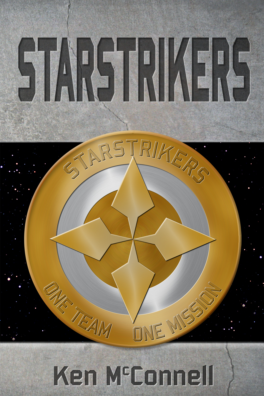
With more room at the top of the book, we enlarged the title to give it more prominence. Next we darkened the background and made it clear that it was more like concrete.
A crack was added because this book takes place in the middle of a war and things were not always going good for the heroes.
The coin was redone and toned down a bit so that it didn’t compete with the title for the attention of the reader’s eyes. Because the coin is featured in the book, we made sure it was obvious that it represented the Starstrikers Special Forces team. We were going to make the coin weathered and worn, but dropped the idea when I realized that the Starstrikers were meant to be a beacon of hope, so to have it weathered would have cast doubt on how effective they were. Besides, have you ever tried to make a weathered coin? It’s not easy.
The last element we improved on was the author’s name. It was decided that the original font size was far too small to help establish a new author’s brand. So we bumped it up. The end result of making it bigger is that now you can read the name much easier from smaller, Kindle sized images like the ones above.
The final version of the second edition book cover is both iconic and meaningful and it sets the look and feel for the remaining two books in the Star Series and other books to come, set in the same universe. This fall will see the release of Tyrmia, the first of the Planet Series books. I’ll have more details about how Byron and I came up with it’s cover at a later date.


Hi Steve, thanks for stopping by. Yes, we did take into account the web when designing these covers. The biggest concern was whether a customer could read the title when it was smaller in size like on Amazon’s page. That is a big deal. Also, we tried different looks like a colored main title text that just didn’t work out as well as gray. Another thing I didn’t mention was that we made the stars more prominent. In the older version they were only visible on the paperback sized version.
We are using computer based artwork more than photography, but that could have more to do with the fact that we are doing SF. We have more leeway with that than we would with say, Romance. Where you like to see real people on the covers. The Tyrmia cover will have original art by Byron and will be feature a scene from the book. This is a big departure for us, but I think it’s going be pretty cool. I might make a post about how that is coming next.
I always enjoy reading how things are done. You’re write up was informative and entertaining. I look forward to the next one. As I read this, I wondered how the Internet is changing book art as authors delve into web publishing. Do you take that into account when developing the cover?